StandardButton
The StandardButton looks like a button, but instead of customizing with text and icon,
it can used one of the pre-defined kind and the text and icon will depend on the style.
Properties
Section titled “Properties”enabled
Section titled “enabled” bool default: false
Defaults to true. When false, the button can’t be pressed
has-focus
Section titled “has-focus” bool (out)
Set to true when the button currently has the focus
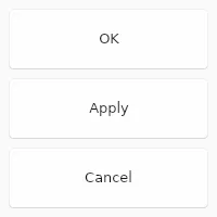
enum StandardButtonKind default: the first enum value
The kind of button, one of ok cancel, apply, close, reset, help, yes, no, abort, retry or ignore
StandardButton { kind: ok;}StandardButtonKind
Use this enum to add standard buttons to a Dialog. The look and positioning
of these StandardButtons depends on the environment
(OS, UI environment, etc.) the application runs in.
ok: A “OK” button that accepts aDialog, closing it when clicked.cancel: A “Cancel” button that rejects aDialog, closing it when clicked.apply: A “Apply” button that should accept values from aDialogwithout closing it.close: A “Close” button, which should close aDialogwithout looking at values.reset: A “Reset” button, which should reset theDialogto its initial state.help: A “Help” button, which should bring up context related documentation when clicked.yes: A “Yes” button, used to confirm an action.no: A “No” button, used to deny an action.abort: A “Abort” button, used to abort an action.retry: A “Retry” button, used to retry a failed action.ignore: A “Ignore” button, used to ignore a failed action.
primary
Section titled “primary” bool default: false
If set to true the button is displayed with the primary accent color.
pressed
Section titled “pressed” bool (out)
Set to true when the button is pressed.
Callbacks
Section titled “Callbacks”clicked()
Section titled “clicked()”Invoked when clicked: A finger or the left mouse button is pressed, then released on this element.
StandardButton { clicked() => { debug("Button clicked"); }}© 2026 SixtyFPS GmbH